Big Name Brand Store Failures
Our resident Brand Store Expert identifies three of the worst examples on Amazon and shows you how to avoid their mistakes.
Building a Brand Store on a major retailer website can feel like an easy decision. Not only is the cost typically low (or even free in number of cases), but the benefits are also manifold. It strengthens and differentiates your brand with shoppers, educates consumers on your products and ranges, and builds loyalty.
In fact, many claim that Brand Stores drive higher conversion overall. In a rare disclosure of metrics, Amazon claim that Brand Stores on their platform will, on average, provide an impressive return:
“Shoppers who visit a Store during their shopping journey purchase 53.9% more frequently, have a 52.1% higher add-to-cart rate, a 42.4% higher average selling price, and a 71.3% higher average order value compared to those who do not visit a Store.”*
*Amazon Brand Store Guidelines 2025
However, what many brands fail to consider are the associated investment costs that come with having a Brand Store: the thought, resource and expertise required to initially create the store, and the continued commitment to maintaining the store in the future.
Without a solid commitment on all these points, not only will your Brand Store become a wasted opportunity, but it may also end up detrimentally impacting your brand’s presence on the retailer, and disincentivise potential shoppers.
That’s why we’ve collected three examples of Brand Stores which aren’t reaching their potential, and asked our resident Brand Store Expert Andy to break down the failings so you can avoid these pitfalls in the future.
Sharp
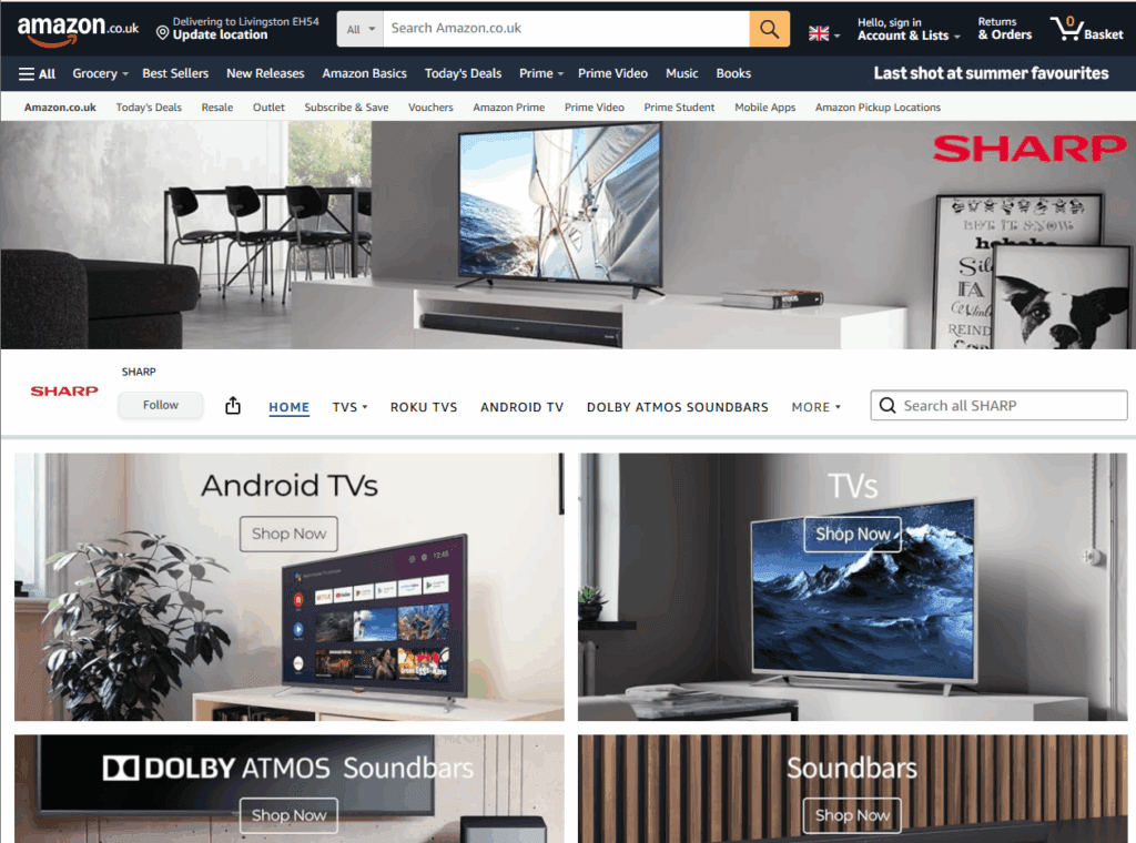
On first glance, the Sharp homepage seems to have had a good amount of thought and intentionality behind it. A grid of lifestyle imagery maintains a consistent brand presence while illustrating the various product ranges on offer.

The issues arise when you realise there are no other designed elements on the page, only an unsorted list of (presumably) all Sharp products available, a messy collection that includes multiple calculators, cash registers and karaoke machines. Key products aren’t featured, new products aren’t highlighted, and there are no collections promoting current discounts or deals. For every shopper who visits this page, an additional click has likely been added to their purchase journey for truly little benefit.
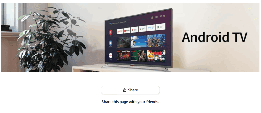
Unfortunately, the issues get worse when you click through to some of the featured categories; namely, a lot of them are empty of product. Air Purifiers brings you to a 2-minute-long video for a product that is no longer available. Android TV presents you with a large banner image and a prompt to share this page with your friends. That’s it.
Other categories are slightly more functional but offer nothing more than an Amazon product search would provide despite this being a longer shopper journey.
Toshiba TV
The Toshiba TV Brand Store has taken a different approach, but one that faces many of the same problems.
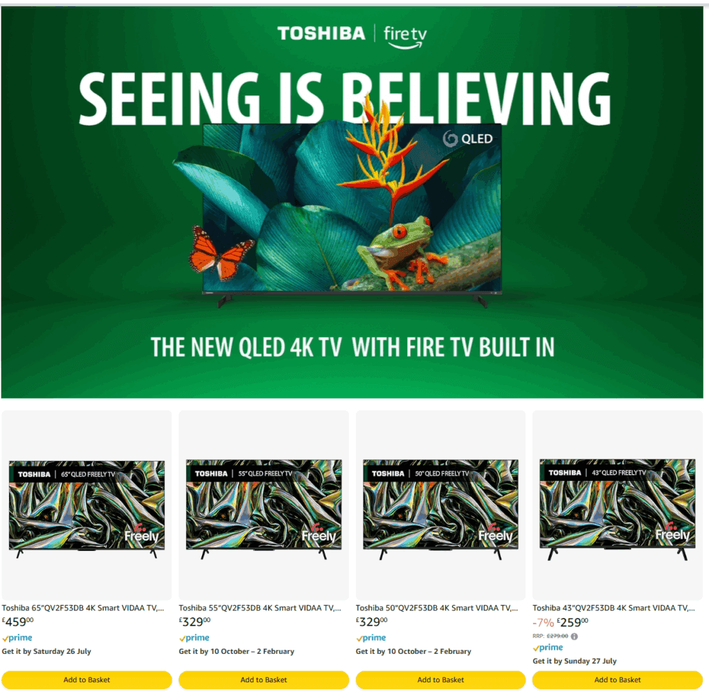
Firstly, the home page has been constructed with the bare minimum of elements. It’s primarily a list of all Amazon Toshiba TV available with a relative lack of unavailable or legacy product on display. Other than that, there is a standard navigation bar at the top, a promotional animated gif that provides very little and… that’s it. No deals listings. No brand copy or imagery. No shopper guidance. Nothing.
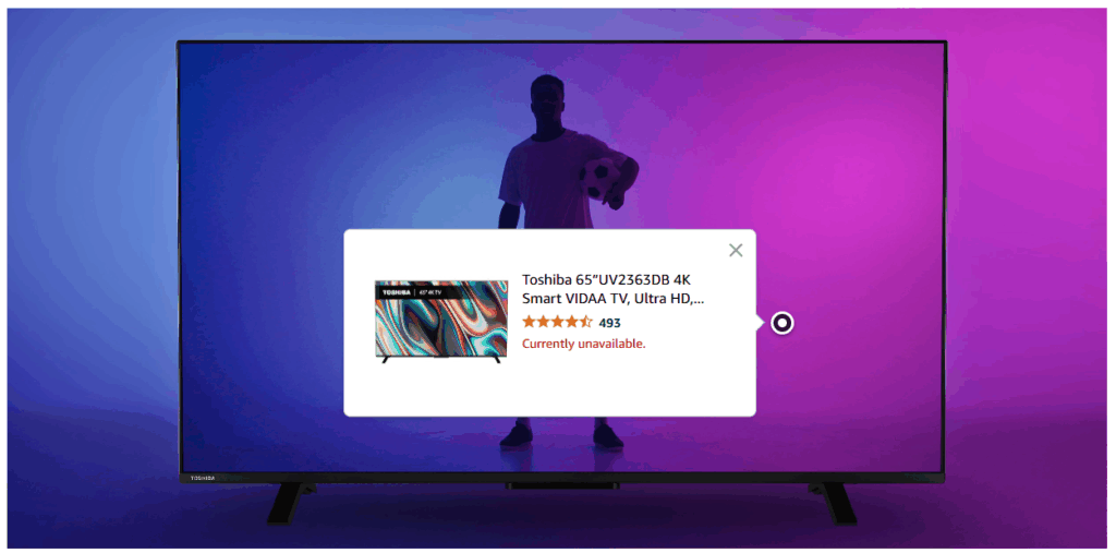
Investigating the navigation bar at the top doesn’t provide anything more. A selection of products are shown in a list, and the top of the page is taken up by a (not even Toshiba-specific) promotional video highlighting the chosen TV operating system. Even worse, navigating to 4K & OLED TVs only provides you with a generic promotional image of a TV, with a hover-over link for a legacy product that is “currently unavailable”.
Nikon
The Toshiba and Sharp stores are more extreme examples of how Brand Stores can fail, but even stores with more attention and focus can still make mistakes that will impact overall conversion.
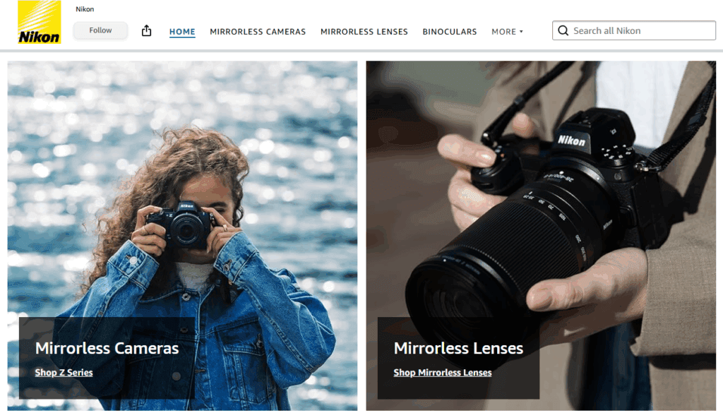
With Nikon, we find a homepage that’s lacking in opportunities to convert. Product categories are linked via lifestyle images that take up most of the page, and formatted in such a way as to need an amount of scrolling before the category titles become visible. Beyond that, only a small section below the fold has links to three featured models of mirrorless camera, with at least one of which is end-of-life. Absent are any mention of current deals or discounts, or brand text informing or highlighting shoppers as to the latest and best technology on offer.
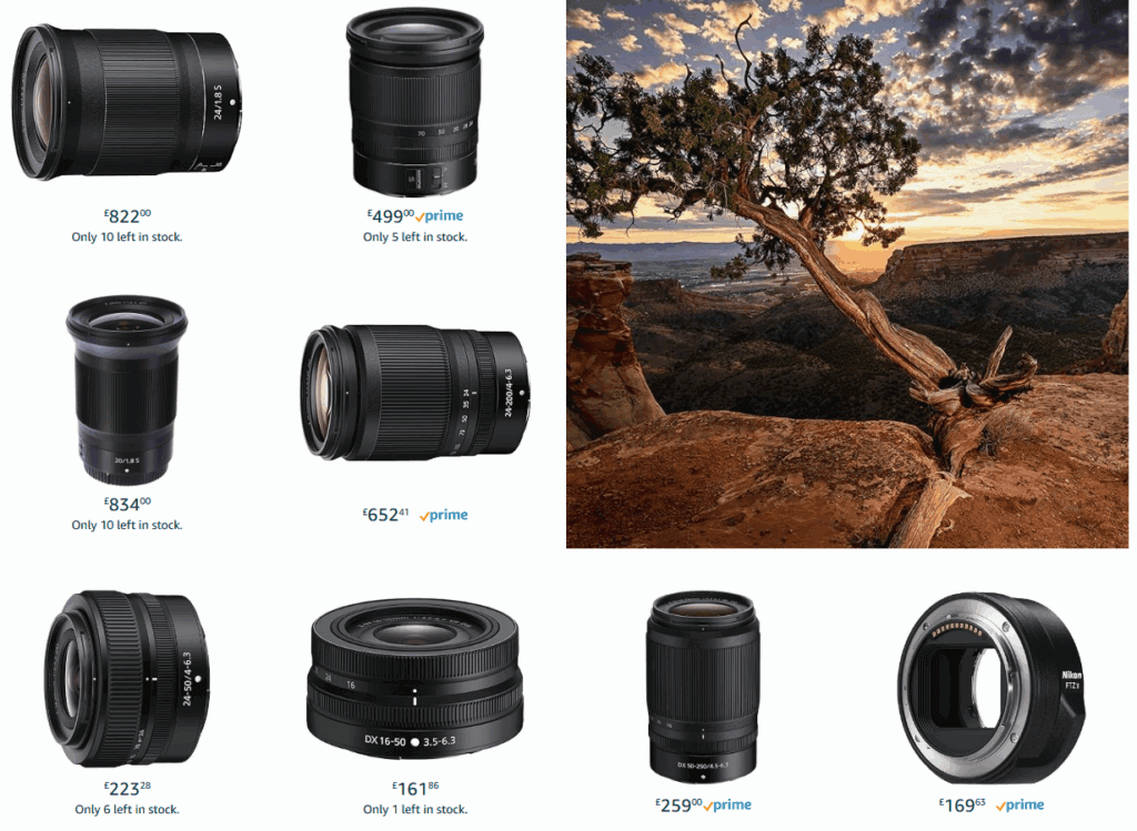
Diving deeper, the Nikon product categories provide a mixture of content types; blending product links, branded text and imagery alongside shopper guidance and education. Lenses can be browsed by usage type on DSLR only, with various features called out to help inform customer choice and drive up-sell and cross-sell. However, for Mirrorless Lenses there’s no further filtering options at this stage, meaning that all types of lenses are here and occasionally presented in a way that could confuse. In many places a shopper may be unable to determine the lens type from the information on the page, and may be forced to click through to the product page for clarity.
How to Avoid These Mistakes
1: Maintenance
When building a brand store, be aware that it takes a commitment of resource to update and refresh the store for it to remain effective and beneficial to your brand. There’s often nothing worse than an empty Brand Store, or one filled with unavailable product to actively reduce shopper confidence and provide a frustrating experience for potential customers. In comparison, an up-to-date store can be a wonderful platform to enthuse about your latest products and the best new technology available.
2: Provide Opportunities to Convert
Regardless of whether you’re actively driving traffic through advertising, your homepage will see the largest number of visitors of any page in your store. Although it’s important to give customers the tools required for them to find specific products, don’t waste the up-sell and cross-sell opportunities. Links to current deals and discounts are highly recommended, as are featured placements for the newest and most popular products within your range. If you’re able to provide faster route to checkout for your potential customers, they’ll be even more like to make that purchase.
3: Don’t Waste the Space
A Brand Store provides you with the opportunity to do multiple things to help your brand, and most retailers will have a host of different layouts and widgets optimised to provide the best experience possible for your shoppers. It’s tempting to lower the maintenance burden by opting for a minimalist layout, but as we’ve seen even the most basic store is still badly impacted by a lack of attention. Better to thoroughly investigate the options available to you, or engage a Brand Store expert to design a store that works as effectively as possible for both you and your customers.
We have over a decade of experience building effective, attractive Brand Stores for international brands such as Nespresso. If you’d like to hear how we can make your Brand Store something to be proud of, drop us a message at info@digishare.eu and schedule an informal chat with our Brand Store Experts.


